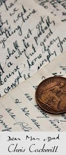
I chose to make a brief which incorporated both my graphic design and photography skills; I did this by creating a book which includes my photography work based around my Grandads experiences during World War Two, this is a photo book but which I have designed myself. I feel the composition is well thought out and flows well, the introduction sums up what the ideas behind it without over complicating things.

Once the book arrieved, i then did a photoshoot in the studio, this is where I have an advantage over single honours design students as I can professionally document my work.


These are some promotional posters which I have designed to go along side my book, I imagined that my book was being published and tried to image what kind of promotions or advertising, this is why I wanted to make bookmarks as they advertise the book but can also be used when they have purchased the book for its actual purpose. I copied an image of a letter which my Grandad had written to his parents whilst in the RAF during World War Two, by editing the image so that it only displayed the writing, I could overlay that onto another photograph of mine. Then for the last two images, I added a block coloured layer with the title of the book cut from it to show part of the image underneath. I feel the last poster is the most successful as you get to see a lot of the photograph and the text is clearly read.


To further my promotion to people outside the university, I decided to make sets of free giveaways which would have my work on and contact details. As I plan to make a book, I chose that making bookmarks was the best method as these would be a good keepsake for anyone who enjoys reading books; also as you constantly have it in front of you whilst reading it is a good way to get your work noticed to make it memorable. I chose to use the photography from within the book, producing multiple pieces would make them a set which people could try and collect. I also did the same with a set of business cards as these can be handed out and then made a set to be looked after.


To further my promotion to people outside the university, I decided to make sets of free giveaways which would have my work on and contact details. As I plan to make a book, I chose that making bookmarks was the best method as these would be a good keepsake for anyone who enjoys reading books; also as you constantly have it in front of you whilst reading it is a good way to get your work noticed to make it memorable. I chose to use the photography from within the book, producing multiple pieces would make them a set which people could try and collect. I also did the same with a set of business cards as these can be handed out and then made a set to be looked after.


This is just a quick design which could be used as a background of a website. It could cover the whole of the background or just sit in a corner, it was made by typing out the font I wanted in white on a black background, blurring it and then creating a 3px x 3px pattern which had red, blue and green lines which when applied to the larger image created a screen effect and made the text have a greenish glow. This is quite an interesting effect as it is not seen now due to modern screens not looking the same.
Trying to experiment with banners for a website, I began using different type to form a headline which would be easily read but also graphically impressive at the same time. I used a cursive font as this gave a sense of elegance and class, I didn’t want the rest of the work to look too classy as it may give a sense of being old fashioned, I used bright colours and made the text look like it had a clean shine to it. Then adding the flick on the end of the writing to finish it off nicely. I did this by lightening areas of the text and painting a slightly brighter blue over one half of the text. This creates the illusion that the text is glistening in the light. I also made the text appear 3D by duplicating the layer and moving the text down slightly and then darkening it to create shading. Finally adding a gradient to prevent the background from looking plain.
I then wanted to try and promote myself and get my name out into the industry, if I have some form of presence, whether that be online or physical then at least I am one step closer to my goal. I decided to make a flyer which would have my contact details on but shows a bit of my designer flair. Instead of having a flat poster, I chose to have something which stood out from the page, by using a photograph of a wooden floor, which I edited slightly to give a grunge feel. I then added a flat rectangular shape on a new layer with a drop shadow to give it the impression of being slightly off the floor. Then adding my text in a list style with line breaks to split it up slightly which gave the whole page a nice look.


As this is my final year at University, it is down to the students to organise our end of year show. Within my professional practice module for this year, I am a part of the design team; this is perfect to suit my abilities as a photographer and graphic designer. I can have an input of how the degree show looks and is styled. I can even make designs of my own which could be used. I feel that the degree shows look should be simple and clean, all it needs to do is explain that it is a degree show and who is hosting it. As the show is Fine Art, Graphic Design and Photography, it can’t just be an image of one persons work as that does not reflect on everyone else.
This is quite a nice, simple design which does the job of showing what the show is, who is hosting it and when. The year is even the key focal point of the design but this may not be enough, this design may be slightly too simplistic, not showing the creativity of the students. The colours work well and the grey is not too dark and the orange isn’t too vivid.
This is a postcard/invitation for the degree show, it would be handed out to guests to let them know about the show prior to actual invitations being sent out. This is so they have early knowledge that there is a degree show in the works to make sure they don’t make any plans for that date well in advance. The design is very simple but uses nice bright colours which will attract a viewer’s attention; there is also enough information to make the audience know what they are going see but not too much as to confuse of bore them.
This is a poster design which I put together to promote the show; it is a simple design where I used the University logo as the main focal point of the piece. I did not simply use the original logo with the regular colours, I used illustrator to create a vector of the image, this means that it uses a set amount of solid colours to convert and image into a cartoon stylised image. I chose to just keep the logo as two colours, white for the outline of the logo and the solid colour is from behind the image. Then for the last design, I used two shades of blue, this looks nice as it is not just plain white.
I have made an alternative design for the poster, this uses influence from the word ‘show’ which makes me think of class and high culture such as a theatre. This is why I have added red curved shapes to either side of the page as it looks similar to a red curtain in a theatre. This is the opening date for our show and the curtains are opening to reveal it to the public. It also incorporates the logo as the main focus using the same two colours for the whole page. The logo also overlaps the ‘curtains’ so that it can all be read clearly.

With this t-shirt design, I wanted to incorporate my photography with other visual, graphical elements to create a piece. This was not going to be an over complicated design as I wanted the photograph to be the main focus. I have recently gone to do a photo shoot at Denbigh mental asylum, this meant that I had a lot of dark and grungy photographs which could be used as a poster or just incorporated in a graphics, I had lots of photographs to choose from but one that stood out was of a broken clock which was spread out on a desk. You could see a lot of details within the image, not just of the clock but of the grime and dust. This was a building which had been abandoned for some time and everything had been weathered and worn to a strong degree.
This is the image of the clock which forms the basis of my design; it is black and white with a strong contrast. The rest of the design will be black and white in order to match the overall theme; I have decided that the design needs to be simple yet striking. Having a heavily edited image with high contrast works well for a t-shirt design as the white from the shirt helps the design really stand out.
I decided adding a frame to the image would work well as it is a different way of presenting something on a t-shirt. A frame is the conventional methods of displaying an object on a wall so why not do the same on a t-shirt? It focuses the viewer’s eye to what you want them to see, it gives a sense of importance, if something is worth framing then it is worthwhile viewing. I used a stock image of a wooden frame, then rendering it to look vectorised, this is so it is not just a picture of a frame but has been stylised and altered, it is then converted to black and white to go with the theme of the design.
I did not want to add anymore to the image apart from the text, this keeps the work clean and simple. I do not like over complicated designs as they can bore or confuse the viewer. I made the text large and bold so that it is easily read. This is because it is then easier to read and as there are only two words then it is the other focus point of the work apart from the image, I want viewers to see both at the same time instead of one after the other. The statement ‘time’s change’ is quite vague but that means that it can apply to anyone or anything so makes it more desirable as a product.
To finish of this design, I made the text which is overlapping the frame, have half of it bold and black, and the other opaque with a thin black outline. This helps stop the text overpowering the rest of the design as you can see through parts of it so it is not the complete focal point. It also helps the viewer see the details of the frame which would be hidden by the text otherwise. I decided to keep the bottom line of text black on the frame as it stops there being too much symmetry but creates repetitions in the design of the text  and shows a theme in the design.
I am pleased with how this has turned out because it is a simple design with an easy to read message. The frame works as it is an unusual and different way of displaying the design and is actually a part of the design itself. Then the text is connected to the work so is not seen as a separate aspect. This works well and creates a piece that flows through, each part is easily seen yet they are not separated too much.

I decided to start off with something which wasn’t too much of a big ask for my first brief, just something which was an open brief so that I could just work to my own ideas and not have to create an idea from a design which someone is hoping for.  I chose a brief to design a t-shirt, this is a relatively easy brief of there are no exact requirements or preferences as it is really just a graphic which prints onto fabric.
I chose to just create work with a simple message, which is just a short statement, it does not have to be a powerful or ground breaking one, it simply has to catch someone’s attention. My first idea for a piece was to revolve it around the idea of consumer products and buying. Spending needless amounts of money on products they don’t need (like a t-shirt). I thought of the idea of a barcode and everyday products need them in order to purchase them. Then the idea of a city came to mind as many people spend their lives travelling into work just to make enough money for these luxuries.
Then I looked at the imagery from both and noticed that a city skyline of tall skyscrapers is lots of long lines, similar to that of a bar code. I decided to combine the two in an illustration which shows both in the same image. Having clouds above then the numbers for the barcode below.

The first step to creating this design is to make the lines which represent the barcode and city landscape. Using the Pen Tool to create black strips, these had to look like a barcode but not have too many gaps or distance between each line as then it would not look like a city skyline. I made the lines at the bottom all level apart from a few lines to create the barcode look and then the top half had a random height for each line, this shows the variation which is seen when looking at building heights.
Next to make the barcode of the design, I added a code to the bottom which is seen on barcode; these identify the product and help make it obvious that this is a barcode. Without these it would not be hard to work out what the work was apart from an odd city skyline.
I then thought of how to represent a city skyline, this is when I had to think what the most memorable parts of a skyline are. Then I realised that the most striking part was at night, when each building has thousands of lights glowing. This really shows that the city is alive, as in the daytime you can’t tell if anyone is in these buildings.
I added white lights to the building; want to stick to only black and white as these are the only colours which are seen on a barcode. I chose to only add the lights to some of the buildings as I did not want to overcrowd the design and kept it relatively simple.
I placed a longer black line down the middle of the barcode lines; this is a road which represents the people of the city having to travel, earning money to buy these consumer products. This also helps link the barcode and city skyline in relation to the message behind it. Keeping with the black and white scheme as to not complicate or confuse matters.
To improve the visual of a skyline, I added come basic cloud shapes in order to give the idea of buildings which tower above the people below, I think these work quite well as they are very simple shapes but portray the idea of a built up city area. I have tried to make sure that there are enough visual elements to represent both the barcode and city without making the whole image over complicated.

To finish off the work, I added text to the top and the bottom of the page, I connected them to the visual itself as it shows how both the words are connected, and you commute to work in order to consume unnecessary products. I feel that this is a good design as it is very simple and clear so that the viewer is not confused by what they are seeing, it can be read in just a short glance and then they can make up their mind about whether they like it or not. This was the goal of my design, to get viewers to understand the simple message without having to study the work or confuse what they are seeing. I could see this going on a t-shirt as it is easily read by others and the message is not offensive or too pushy, it is not trying to force people to change their ways but to just think for a moment.